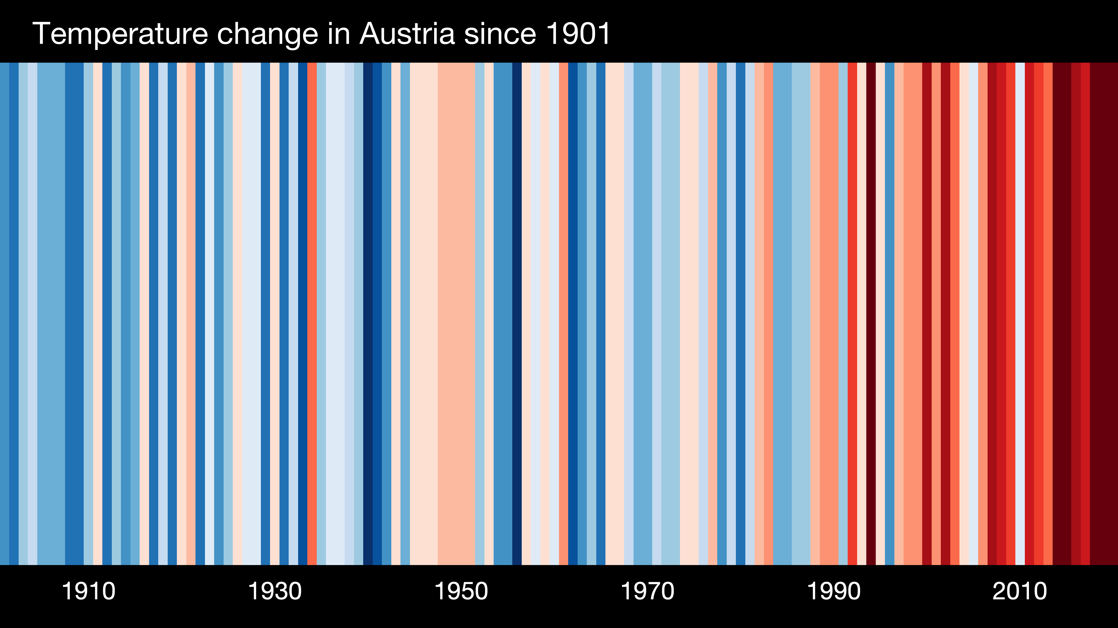
- The stripes turn from mainly blue to mainly red in more recent years, illustrating the rise in average temperatures in that location (Austria in our example).
- For each country, the average temperature in 1971-2000 is set as the boundary between blue and red colours, and the colour scale varies from +/- 2.6 standard deviations of the annual average temperatures between 1901-2000.
- The data comes from the Berkeley Earth temperature dataset, updated to the end of 2022. For some countries (USA, UK, Switzerland, and Germany) the data comes from the relevant national meteorological agency.
- The stripes are typically shown starting from around 1900 to 2022 but this can be longer or slightly shorter depending on the location and whether the historical data is available and considered robust. https://showyourstripes.info